
 Andy Woodruff over at the Bostonography blog wrote a post in December 2012 entitled Blue and Bluer: Massachusetts and Boston. The post provided some really interesting insights into the voting habits of Boston and Massachusetts; home to some of the most progressive voters in the United States.
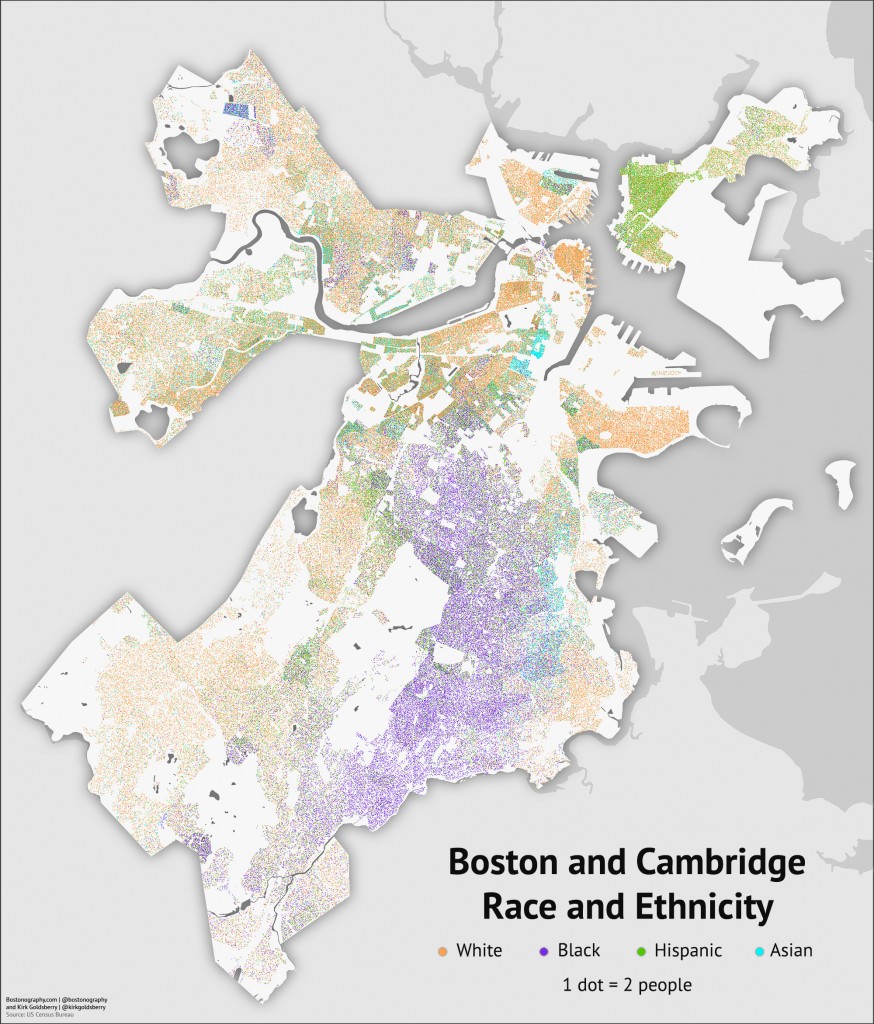
Part of that analysis included a breakdown of racial groups in Boston. It is not clear to me if the breakdown is based upon registered voters or US Census data, but either way it is an interesting image (see above). I would love to see how this has changed from the previous century in decade blocks. My guess is that the map of Boston has become far more colorful in the past 30+ years, and to paraphrase Martha Stewart, I think that is “very good thing”.

That’s a pretty fascinating map. Providence too is a mixture of white, black an Latino in very small areas. For example the section I live in has about equal populations of each.
LikeLike