
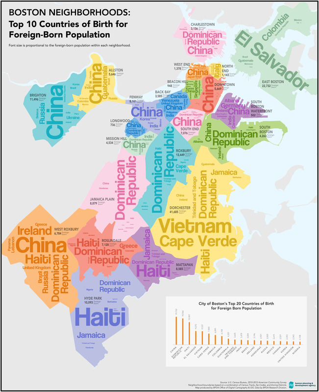
 Earlier this week Adam who publishes the excellent blog, UniversalHub, shared this map from the Norman B. Leventhal Map Center at the Boston Public Library. I found this particularly interesting, because although I was only born a few miles from Boston in the tiny town of Winchester, MA, Sergio was born about 4,500 miles to the south in Brazil. You can get a better look at the map and zoom in to see some of the smaller printed nationalities if you click here.
If you like this sort of thing you should stop by the BPL to check out their exhibit Who We Are: Boston Immigration Now and Then.
On a related note, Pew Research’s map shows how different nationalities came to the United States, starting in 1850 up through 2013.

For more information visit Pew Research here.
