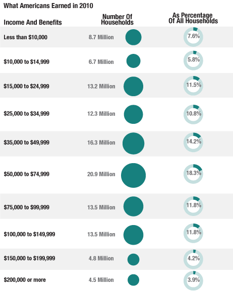
I’ve swiped the title from an interesting article on NPR’s website. If you are like me you love charts that show information rather than listing content simply in text. The chart just below provides an interesting look at what American households earn. Just to be clear, a “household” consists of all the people who live in one house or apartment; including families, roommates, etc… These numbers come from the more than 114 million households in the 2010 Census. What this shows us is that the median household in the US makes approximately $50,000 in income and benefits per year; meaning 50% made more and 50% made less.
The article overlays that information with geographical data. This is where I know I’m a marketing geek, because I just loved this bit. You’ll see that many of the wealthiest states are ironically what would be classified as “blue” states (more progressive) or in the case of states like Colorado, New Hampshire and Virginia trending that way.  Read into this what you will. If you like you may read the article on the NPR website by linking here.


Interesting indeed – the median is much lower than I expected.
SteveA
LikeLike
Very interesting. I had to share with my Facebook and Twitter peeps! Dave
LikeLike